Friday


And finally the calamity
Well I have done what needs to be done on the unreal level, it took ages. But despite all this effort I can't place GUNS! I have tried everything under the sun to fix it and apparently I'm not the only one who cant do it either, plus I've heard a lot of people's stories of glitches and invisible walls. This is very annoying because I need to game test it soon and its going to be hard with no weapons or items, I can place player starts however. But anyway this left my with no choice but to use what I had I took a few people around my level and i watched dhow they moved around and explored or got lost, it was all very helpful in making last minute alteration, in fact one of the main game testers Terrance Nabbs wrote four sides about the level on all of our opinions about it and what needed to be changed. (Click to enlarge)


This helped make some last changed despite the opinions based against it not having weapons, me Jack Boyles, Tez, Richard Norman, Ollie, Graham and Ashley Nabbs all tried to imagine how things would play out in certain situation, the discussion where pretty in deep sometimes, all in all I'm happy with it but I'm not finished with it by far if i had the time i would make it bigger, maybe less compact but that would alter the feel of the level. The textures are my number one hate, defiantly going to do differently next time.
Using time like a one night stand
Now there isn't much time left so I have been doing all the things to finish my level off, the floor and ceiling have been given there final touches and the tedious texturing of stairs is over. also I have now placed a few large crate to jump around on in the decks, also I have placed a lighting scheme, one serious problem though is how horrible Unreal ed really is, I have been wasting hours of my time fixing glitches in the game and when i finally do other appear, in fact I seem to be making it worse sometime and if i want something big like a pillar or a support I cant because it causes problem with then level, you can see through walls and everything sometimes, other time i wont be allowed in certain areas of the level like an invisible wall is blocking my way.

I did the texture for the crates in flash, I gave each part a different layer then put that in Photoshop and gave it shadows, this gave off a nice Team fortress 2 like "3dness" to it despite its bold red colour.
Cant get enough

I cant get enough of just putting random things into this level, but I'm afraid I will run out of time so now I have been doing textures mostly, I created this wires texture from a photo that I am going to use to show a bit of power flow through the ship to hopefully make it more believable. Also i am going to make a view into outside space.
The level is really starting to take shape by this point, my aim is to make each area of the ship differently themed so there is a distinction between all areas of the game so its harder to get lost I have found that leaving engineering can be hard but that's if you forget where the exit is.
By this point i have decided to scrap the whole space station idea as i feel i should concentrate all my efforts into making them ship really good because it works well as a 8-10 player game with enough areas for weapons to go.


To help with my texturing dilemma I used the classical yellow and black caution strips this helped me frame a lot of the levels features which somehow gave them a very interesting look. in this environment.
A while in the works


This is after a few weeks of design, I have taken the opportunity to add lots of little things t0o frame the rooms and i have a lighting scheme in mind, I already placed a great one in engineering, a really great red light that travels far. I'm not even finished modelling but already I can squeeze in so many paths to different rooms. The level does look a little blocky at this point and it had low ceilings and I still don't really know what my texture and colour theme will be.

getting textures to work has been annoying but it has been solved recently thanks to getting Adobe Cs4 and a few patches for Unreal, hopefully now textures should work without problem, and I can believe it took me this long to finally get it, that you have to put mylevel in the package name. So a problem pretty much solved there
A test run
i just thought I should pop in here a quick video i did early one in my visualisation project, here i am just rotating the camera around the high res blossom to see how it looks from all angles because it will be seen from every angle as it is used over and over again in the scene. This proved useful and made me notice the indentations in the petal and that it needed smoothing.
Design in
My unreal level is taking shape nicely I have been focousing on the bridge and building down from their, i dont evenneed to try very hard to give this level more feel than its Timesplitters version, so as I am going along them level is just taking form. One thing I have noticed is that I need to keep reminding myself that this is unreal so try to avoid those long narrow corridors.
A new way?
So i had a hard time actually piecing together my level in design until i remembered what i used to do. i used the level editor from Timesplitters, this is because it is the only level editor that has an easy drag and drop software, this mean I can make a very-very basic layout of corridors and rooms, once I'm happy i can build from that.
 Now this might seem a little bizarre but it really did work, I could make mistakes change corridors and try out so many ideas at once that would take me weeks on another piece of software. Through this I could really picture what i wanted and keeping in mind I'm designing a PC game and I can change anything I see here. On the top picture I got to try all different kinds of lighting scheme in a few mins, that one i went for multi colour instead of red, it didn't work very well.
 The two pictures above are the two main maps the top one is the space station and the bottom one is the spaceship. how they link together will have to be designed on elsewhere because there isn't enough memory on a PS2 memory card to fit them both on one map. Shame
I settled with these two main ideas and took them away from the PS2 after hours of tweaking. To transfer them to PC I simply placed my T.V next to my screen and copied them by eye, making sure it scaled correctly to the game.
Unreal Unreal

So when I heard that we where going to be doing unreal as a project I immediatly started trying to remember my faveourite maps fromFPS over the time the one I settled on the most was this one above, the map for Bunker in Goldeneye, a great map for such a basic shooter. I used it a lot for my inspireation and looking over these maps I began to shape my own idea, I wanted it to be out in space on a mysterious alien ship, on of those where you dont know what anything does, I also wanted it to include a small space station next to it a low gravity so you can jump to it. The design below show my two supporting and main ideas for the project, the docking area on the engineering deck of the ship.


Despite it being inside a spaceship i wanted player to have a lot of alternative routes and lots of highground and escape routes but keeping it to a reasonable level. i had a picture in my head of the level and a few designs but I needed so basis to get my level going and get a solid idea down.
Animation 2.9
The animation process is looking slow at this point, i am happy that everything looks like it is working now, after I spoke to Andy I found out that i scaled my bones down which apparently can cause that problem so I just did it again differently. But like i said its slow so I guess i need to persist.
 The scene itself is looking good, I learnt a new technique for this project which is the use different channels for different materials so that you can give certain ones glow effects and such without effecting the whole scene. So I did this to give the background and the lasers a neon glow effect, well with the lasers I had to hide them until needed. And without a doubt this also makes my scene look much more Tron like so continues the inspiration. In the animation though I have come to use blue and red more, the virus that they have to deploy is red just like them and everything else that is carrying power is blue, at the end it will be shut down or changed colour thanks to them.
 In the picture above I did thelast bit first as I was not ready to use them both together yet, here he is about to quite literally punch in the code to take over the area.

Using Adobe Premier Pro I edited the footage so it would look better cut and I could cover my animation from different angles at once then cut them in.
The Models
These are the models i was talking about, these where dug up from an old Han tomb recently last year and they show us what certain buildings looked like, I considered this a goldmine but at the same time not a great amount of detail can be made out nor any colour but nevertheless its a great start and gives me a good shape to start with finally

Bones
So now i have reached the stage of modeling the other character and putting bones in both of them, I have also started on designing the environment that i will be using to capture their movements in.

I am quite happy with how she looks, i made a few changes to her also like raised shoulder pads to give her a stronger shoulder line but vertically so its less masculine. i have also textured her fully with a very shiny grey metal for the really tough looking areas and appropriate colours every where else, also she has glowing red body parts to make her look more powered up, however she does lack the spikes up her back and is instead left with three stumps.
Rigging up the bodies was relatively simple, using IKlimb solver helped a lot but I couldn't achieve some movements that I wanted to, the real snag which up to this point I cant solve is why the legs change shape when I move them around, so for example if I was to make him put his leg up it would squish the lower leg and the knee would become oval, soon i will meet Andy in a surgical to see if he has any help.

These are a few shots of the environment so far, it has two main scene areas and places for expansion, I want the scene to begin at this point above where they will drop in, I seem to have made the scenes very tron inspired with long stretches of path and places for lights.
The 3Dmax work
At the same time that I designed the larger bulkier version of this character I also put the brother into 3D max, no bones have been placed yet but the chance to make him into 3D has made me make a few modifications even further, for instance I put in a backbone the is tilted back at the top, it is like a tube and runs from the shoulders and down to the pelvis, this makes him look like he is being held up almost, which incidentally makes him look more robotic.

In the picture above I am cloning the leg and arm so that the body is more symmetrical.

The antennas on his head and spikes on his back are going to react to emotion, this will help give him more of a voice because of the lack of facial features, this will usually happen when he is surprised or alarmed, the antenna would flatten down when he is sneaking or sad.

Here I am attempting to texture some parts of it, one this I am defiantly going to use is this red wires texture, it was one i made for my unreal level project, it is really just a picture of my wardrobe screens gone through Photoshop. There is a blue, red and colourless versions of it, i am going to use it to signify who is the enemy and who is ally. The two main characters will have the red wires on their body, and will be show flowing throughout them, where as most of the environment will be the blue colour. This is the rendered version of the male character without textures which looks better at this point. What you cant see here is a double set of metal plates to protect his back, all the parts on his body will be linked back to the limbs so they will follow them as the move.
So its been a while
So its been a while since the last design of the smaller character and after lots of thought the other to accompany him is a bigger version of hi,self equipped with armour and heavy weapons, and also female. She is designed with all the original ideas in mind. I tried to make her look like she was based on the same model or design as her brother but modified or constructed as a different model, all hopefully told to the viewer without narrative and just through there appearance together.
Notice how she differs but some of it has just been modified, like the feet claws pointing forward instead of two at the front and one at the back, she would look almost the same if it wasn't for the metal plates covering her legs and shoulders, this added with the different pelvis (that has less moving parts and so looks less officiant) makes her look slower but stronger. She also has a double laser weapon and a more effeminate colour scheme.
First Model
After a while I came up with this model of one of the characters, at this point I don't know what exactly I am going to do with it but this is what I had pictured in my head for the smaller one, even if it winds up only being slightly smaller. My idea has changed again based on this drawing and I think it is more likely to be completed this year compared to the last idea. This is the design I did in my sketch book:
As a lot of characters that sit at the centre of a franchise there is some kind of twist between them, like one is grown up and the other young or they are linked like brothers or father and son, for this i wanted to twist on an expected result, this is that this character being the stealthy, small weapons character it is also the male of the pair. The other to counter that will be female.
Animation 2
So when i was given my brief I had many ideas almost immediately, I went through a lot of phases of thought until I started to modify on an idea I had already. This was a game I did a few designs for, it was a FPS game which needed 2 people to work together to fight other enemies, but it was most based around the multiplayer game where partners fought other partners. The reason it was co-op was because one player controlled a large bulky tree climbing organism with heavy weapons whilst the other controlled a very small robot which ad to stay near the larger one for safety, it had precision weapons and cold infiltrate because of its small size.
So from this I changed it to another extreme based on size that was more fitting for the brief, it involved one player controlling a huge robot which slowly moved but could launch hellstorms of explosives and attack buildings and everyone else one the team was deployed from it as a spawning base as small soldiers with assault weapons, the robot and other machinery would rely on them to take down things that threaten them and the soldier would rely on the machines for cover and heavy fire.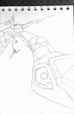
These ideas are a lot I know but I have come to start these projects off with big ideas because its always easier to scale down which I expect I will be doing a lot of with this.
Thursday
Development
This post will show my progression through this project using screenshots from beginning to end. The backdrop house in progress.
 First placement of blossom trees after importing the model.
 Positioning the dummy trees som i know where the proper one will be.
 Creating the grass.
 An overview of the enviroment in its early stages.
 The first screenshot, this started off with just 1 giant cube.
 It should be noted that the high resoulution flower that I created for this tree diddnt work out, in fact the blossom above which has a much lower polygon count was also still too high, so to solve this problem I met Andy Love in a surgical and told him about my problem, he suggested to me to create a tree that imply wrapped a texture around a sphere using opacity, where you make a version of the texture in black and white which defines which parts allow light through it. This proved to be the most useful solution even though I suffered some grahical slowdown it wasnt as bad. Personally I felt it would have been nice to use the tree I intended, it would have looked really good.
 One of the never used blossom textures.
The high res blossom before smoothing.

The shape I used to base my blossom on.

The default blossom texture made in Photoshop.

The dummy tree, first used to model the better trees.
.JPG)
 The high res blossom from above, notice how it gets yellower in the middle just like some existing breeds of blossom.
.JPG)
Modeling the tree.
Subscribe to:
Posts (Atom)
